
9.5 minute read
Standing out from the crowd
Logos are one of the most important aspects of brand marketing.
This is because they’re often one of the first things people will see.
They provide potential customers with a visual representation of your company’s identity, culture, behaviour, and values.
Successful logos stay in the mind
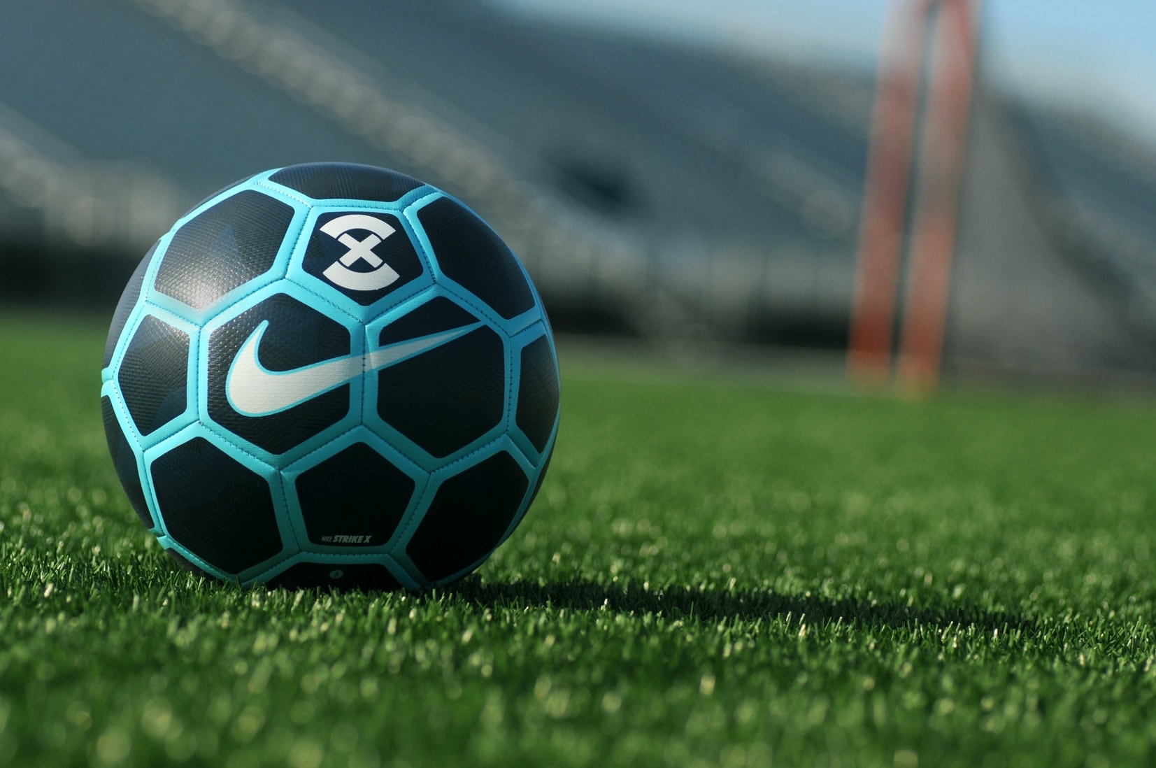
The Nike logo is one of the most instantly recognisable and successful logos of all time.
It’s a fluid shape that indicates speed and movement. It also looks like a wing, which hints back towards the brand name, Nike, derived from the Greek Goddess of victory.
Of course, all companies dream of hitting the jackpot in the same way Nike did.
Having a logo which is unique, easily distinguishable and which relates to your business so well would be the perfect way to separate your organisation from all the others.
In the rest of this blog, we’re going to discuss the vital elements needed to design that perfect logo.
How can a great logo benefit your company?
You can gain a competitive advantage over your rivals by developing a compelling brand image.
As consumers, we are continually the subject of implicit company branding wars, where brand logos and slogans are a ubiquitous component of everyday life.
Indeed, the success of many of the world’s largest and most successful companies can be closely tied to their timeless and instantly recognisable logo designs.
What we expect to see in 2021
Coronavirus has completely changed our lives as we know it. Imposed restrictions have led to shops closing and people having to think of new ways to generate business.
With fewer people in shops, whole new streams of traffic will be coming online and the competition will become fierce.
Having an eye-catching logo and a strong brand design will be one of the best ways to stand out from all the others.
What we expect to see is companies coming up with new marketing strategies, logos and colour combinations to make sure that they’re giving themselves the best possible chance of attracting customers.
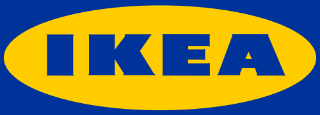
Ikea
A recent experiment asked 156 people to recreate the logos of ten of the biggest brands in the US from memory.
The results showed that most participants managed to successfully reproduce the correct colour palette – underlining the importance of colour in the creation of a memorable logo.
Yet the highest recorded success rate of participants producing a near-perfect drawing of any of the ten logos was a mere 30%, with IKEA coming out on top.
The longevity of their logo, which hasn’t changed since 1983, may also help to explain the high level of recall.
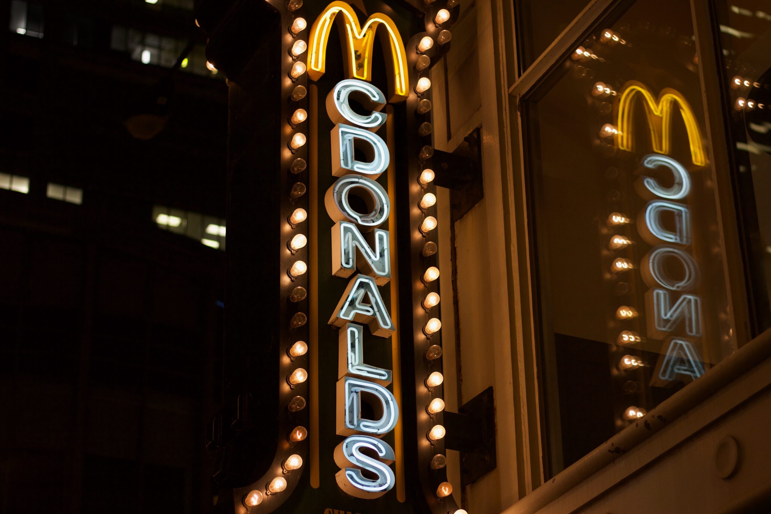
McDonald's
Likewise, McDonald’s has retained their Golden Arches’ since the early 60s.
Its introduction coincided with near exponential growth and rampant expansion in both the US and for the first time in the company’s history, on international shores.
The simple but iconic design has since established itself as an enduring symbol of the company.
And if you want to know more about the history of the golden arches, you should watch The Founder – it might make you feel a bit differently about McDonald’s though!
Every business needs a logo
It’s also vitally important that small and medium-sized businesses ensure they have engaging branding and a strong logo design.
The creation of a strong brand image through effective graphic design ultimately gives businesses the legitimacy and credibility to flourish and continue to compete in their market.
The large multinationals certainly provide a useful framework and interesting case studies for smaller businesses with aspirations for future growth. Choosing to take a leaf out of their books could certainly provide a catalyst for success.
So what makes a logo design successful?
1. Creating an impression through simplicity
Simplicity not only improves a customer’s likelihood of being able to effectively recall a brand’s logo, but a clean and straightforward design can also be easily digestible by impressionable consumers.
Using a legible yet stylish typeface is absolutely paramount. That said, simplicity should not come at the cost of stale and uninspiring logo design. Aim to strike an effective balance between quirky and simple.
Here’s another great benefit of simplicity:
Simplicity also allows your logo to be easily used on all your marketing materials. A holistic approach to logo design should extend as far as considering how it might look on anything from a business card to a billboard.
If your logo can be easily printed onto mugs, caps and t-shirts then that’s another huge bonus.
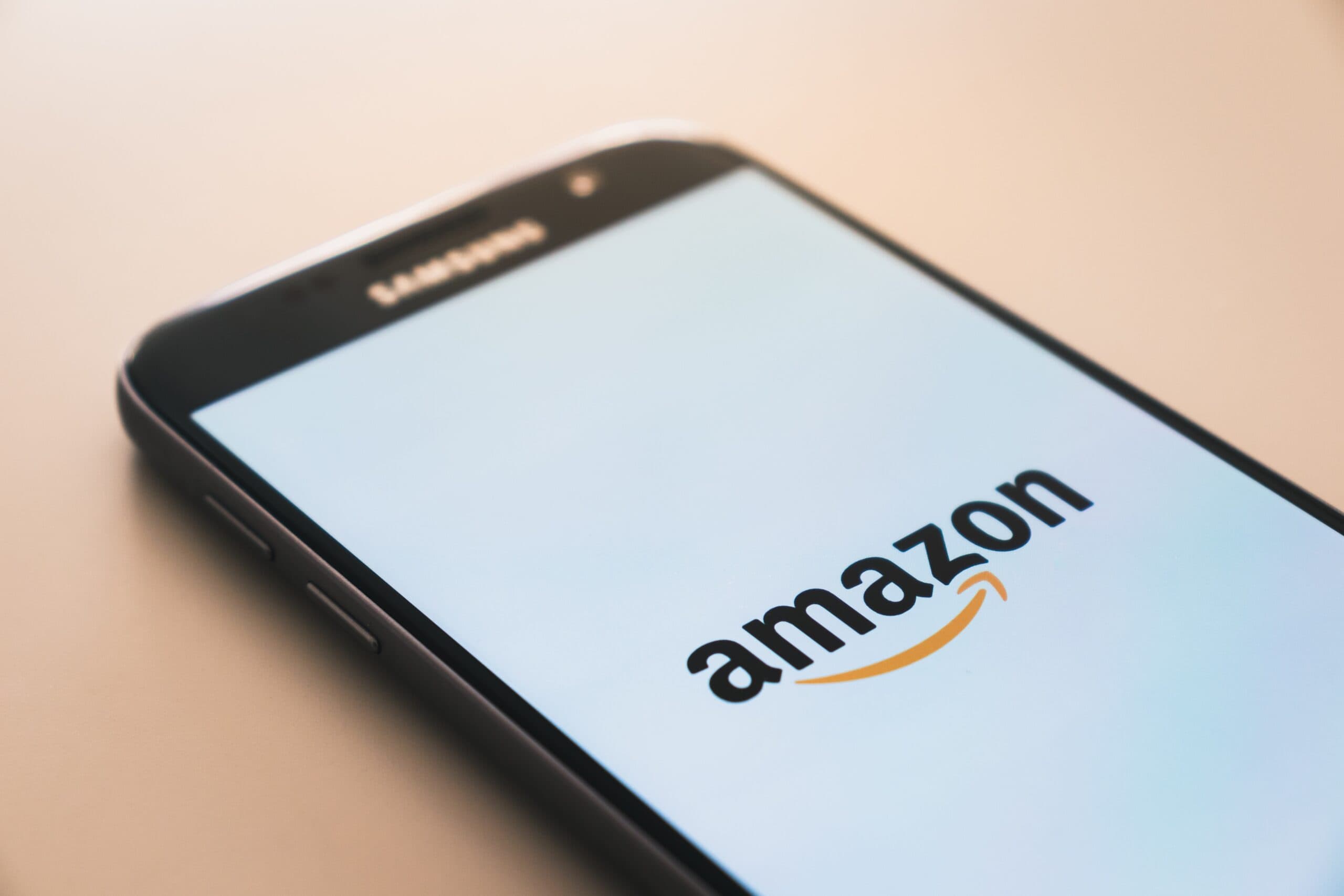
Amazon's clever logo design
The Amazon logo uses a heavy but easy-to-read typeface that is unique to their company’s branding.
The inclusion of a yellow arrow pointing from A to Z instinctively helps consumers make deductions about Amazon’s business model – in that it offers an incredibly wide selection of goods, with the arrow’s smile-like shape thought to represent high-levels of customer satisfaction.
Without this arrow, Amazon’s logo would be quite vapid and mundane. Yet the arrow’s inclusion and underlying message have helped to skyrocket Amazon into being one of the biggest brands in the world today.
2. Colours play an important role
Another crucial consideration in logo design is the colour palette. While the use of bold colours can help to grab the attention of potential customers, it also runs the risk of being too assertive and ostentatious.
Conversely, pastel colours can help cultivate a more elegant and polished brand image. Though, they may struggle to capture the attention of customers against competitors with stronger colour schemes.
Moreover, colour psychology has shown that the specific hues used in marketing and branding play a critical role in predicting human behaviour and brand perceptions.
The colour scheme you use in your company’s branding may, at least on a subconscious level, evoke certain emotions and messages about your company’s ethos and brand personality.
Here's an example of colour psychology in action
The strong use of the colour red – used by brands such as Coca-Cola, Netflix and Nintendo – infers emotions such as excitement, youthfulness and bold ideas.
While blue (heavily used by the likes of Oral B, American Express and NASA) provokes perceptions of professionalism, dependability and trustworthiness.
Furthermore, one of the recent trends in modern logo design (and graphic design more generally) has been a movement away from gradients and shadows.
Nowadays, graphic designers now tend to favour using fewer colours to produce flat and understated logo designs.

3. Be unique!
As we have highlighted already, the most successful logos are those that are easily identifiable.
Though easier said than done, it’s vital to create a brand image that suggests you do things differently – this will help you in the long-run to steal a march on your competitors.
Your company may claim to be cutting-edge, but how successful are you at demonstrating this through your logo and company branding?
While your business may aspire to emulate one of its competitors, that doesn’t mean you should replicate what they’ve done already. You’ve got to try and beat them at their own game through innovative branding and design.
Truth be told, it’s a real test of any graphic designer’s creative abilities to think outside-the-box and create something your competitors haven’t. Nevertheless, it’s certainly worth investing some serious time and thought: it really could be crucial in defining the future success of your business.
4. Really great logos have a story to tell
It’s been well-documented that the logos of some of the world’s most successful brands have deeper meanings than what initially meets the eye.
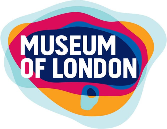
One example of this is the Museum of London’s logo. What may at first appear to be an assortment of colourful and attention-grabbing circular shapes, actually serves as a geometrical representation of how the city boundaries grew over time.
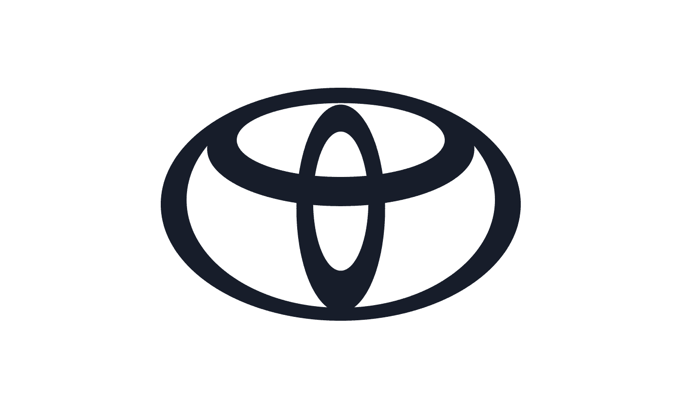
Toyota’s logo also has a deeper ideology behind it. Comprised of three overlapping ellipses, each of these three oval shapes signify three distinct aspects of the company’s ethos.
Taking an almost Venn diagram approach, the two inside ellipses represent the “unification of the hearts of our customers” and “the heart of Toyota products”.
These two concepts are then encircled by a larger oval shape that represents Toyota’s “technological advancement and the boundless opportunities ahead”.
Toyota is one of the brands that has moved towards a flat and simplified logo as of summer 2020.
Hidden messages are quite often achieved through the creative use of negative space. The FedEx logo has received numerous design awards, largely due to a very simple but hugely powerful use of negative space.
More eagle-eyed observers will notice the arrow that appears between the “E” and the “X”, which according to the logo’s creator could symbolise “forward direction, speed and precision”.
Following the introduction of their logo in 1994, FedEx oversaw a significant upturn in profits – helping to catapult the company’s status to the global powerhouse it is today.
5. Successful logo designs rarely need a complete overhaul
Several of the largest and most prominent brands rarely choose to redesign their logo.
Regarded as the best-selling Belgian beer in the world, Stella Artois’s current logo still closely resembles the one used following the company’s founding in 1366.
Unfortunately, even some of the best-designed logos have an expiry date. However, this does not mean a complete overhaul of an established brand’s logo is advisable.
Instead, modernising the existing logo through subtle tweaks will ensure it retains those important and defining characteristics. That way, the company can still be easily identified by its new logo but an updated design will provide the company with a refreshed and modernised company image.
This can be achieved by updating the typeface to a more modern font, removing outdated elements such as shadows and overlays and revising the company’s icon.
Two examples of a successful logo redesign would include the Google Chrome icon and the eBay logo.
In the case of Google Chrome, the revamped logo retains the colours of the original logo – these colours also reflect those used in Google’s main logo.
The new icon is far more streamlined following the switch from a heavily-contoured 3D view to a more modern 2D shape that uses only flat colours.

Similarly, eBay’s updated logo also retained its vibrant polychromic colour palette and playful overtones.
Yet, a change of typeface has helped to modernise the company’s image. Incidentally, this 2012 redesign was the first for the company following their launch in 1995.

Some companies go through rounds of focus groups, expensive testing and research and then still come out with a logo that makes people wonder where they spent the money. Others manage to quickly produce a logo that lasts for years and is seen as a classic.
While there will be an element of luck to this, and there’s no set rule for what makes a logo, these principles above help to explain why some are so successful and other logos are a flop.